What is the best graph to present performance indicators and your goals? Today, with the use of spreadsheets, it is easy to create an infinite number of graphs to present the desired data, but not all of them are suitable for the type of information you want to convey.
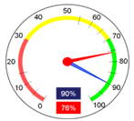
The use of the “speedometer” became widespread with BI’s (business intelligence) who took the term “Cockpit” in English literally, which means a pilot’s dashboard. While the metaphor of “running a business” can be useful, indicators where data is compiled periodically (usually monthly) are not ideal. It is best applied to discrete point measurements, such as car speed or wind speed.
To present the indicators, Stratec's Strategic Management software works with bar and line graphs, where the color of the bar (normally the one performed) is compatible with the status of each month (red, yellow, green or blue). This type of graph, copied below, has several advantages over the “speedometer” graph illustrated above. Among the advantages we can mention:
- Trend visualization since all previous periods are displayed and not just the current status;
- Identification of seasonality in the target, which is especially important when there are targets for gradual improvement throughout the year, or expected seasonal performance for a given indicator;
- Possibility of comparison with the achievements of previous years, targets for the following years and benchmarks;
- Avoids distortions in performance analysis due to the choice of measurement unit. In the graph above, the presentation is significantly different if we use the “Market Share” indicator or the “Increase in Market Share” indicator, since the measurement of both would have the same purpose.


